
Discover the best practices for creating a mobile-first design that enhances user experience, boosts engagement, and improves site performance.

In today’s digital landscape, where more than 60% of web traffic comes from mobile devices, adopting a mobile-first design approach is not just a trend—it’s a necessity. If you’re wondering what are the best practices for creating a mobile-first design, you’re in the right place! Let’s dive into some engaging tips that will help you create a user-friendly mobile experience that keeps your audience coming back for more.
| Best Practice | Description & Implementation Tips |
|---|---|
| Prioritize Content | Identify and display the most essential content and features first, as mobile screens have limited space. |
| Establish Visual Hierarchy | Use size, color, and placement to make key elements (like CTAs) stand out. Keep layouts uncluttered. |
| Design for Touch | Ensure buttons and interactive elements are large enough for tapping; avoid hover-dependent features. |
| Simplify Navigation | Use intuitive menus (like hamburger menus), collapsible sections, and clear pathways to main content. |
| Optimize for Speed & Performance | Compress images, streamline code, and minimize HTTP requests for fast loading times. |
| Responsive Layouts | Use responsive design techniques so your site adapts fluidly to all screen sizes. |
| Avoid Disruptive Pop-ups | Minimize or eliminate pop-ups that block content or disrupt user flow on small screens. |
| Accessibility | Ensure text is readable, color contrast is high, and navigation is usable by all users, including those with disabilities. |
| Test Across Devices | Regularly test your site on various devices, browsers, and screen sizes to ensure consistent performance. |
| Progressive Enhancement | Start with a basic, functional mobile version, then add features for larger screens as needed. |
| SEO Optimization | Structure content and metadata for search engines, as mobile usability impacts rankings. |
| User-Centric Approach | Understand your audience’s needs and behaviors to tailor the design accordingly. |
Summary of Key Steps
- Start with content inventory to determine what’s essential for mobile users.
- Create wireframes for mobile screens first, focusing on core functionality and user journeys.
- Scale up: Once the mobile experience is solid, expand the design for tablets and desktops, adding enhancements as space allows.
- Continuously gather feedback and iterate based on usability testing and analytics.
Mobile-First Design: The Ultimate Guide to Optimizing Your Website for Mobile Users
Prioritize Content: Less is More
When designing for mobile, the mantra is simple: prioritize content. Mobile screens are limited in space, so it’s crucial to identify and display the most essential content first. Think about what your users are looking for when they visit your site on their phones. Are they searching for contact information, operating hours, or perhaps the latest blog post
By focusing on these key elements, you can create a streamlined experience that caters to your audience’s needs.
Imagine you’re designing a restaurant website. Instead of cluttering the screen with images and lengthy descriptions, you could prominently feature the menu, location, and a click-to-call button. This way, users can quickly find what they need without scrolling endlessly.
Remember, less is more when it comes to mobile design!
How to Create a Mobile-First Design that Boosts User Engagement
Establish Visual Hierarchy: Make It Stand Out
Next up is establishing a visual hierarchy. This means using size, color, and placement to make key elements, like call-to-action buttons, stand out. A well-structured layout not only looks appealing but also guides users through your content effortlessly.
For instance, consider using larger fonts for headings and contrasting colors for buttons. This will draw attention to important features and make navigation intuitive. An uncluttered layout is essential; it helps users focus on what matters most without feeling overwhelmed. So, when you’re designing, think about how you can use visual cues to lead your users on a delightful journey through your site.
Design for Touch: Tap, Don’t Hover
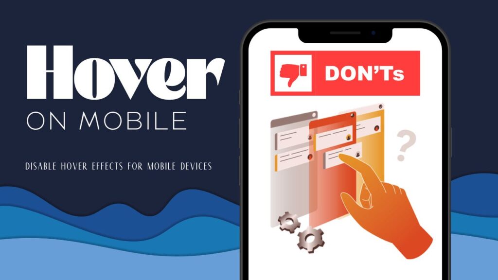
In a mobile-first world, designing for touch is paramount. Unlike desktop users who can hover over elements, mobile users rely on tapping. This means your buttons and interactive elements need to be large enough for easy tapping. A good rule of thumb is to ensure that buttons are at least 44×44 pixels, which is the recommended size for touch targets.
Avoid hover-dependent features, as they simply don’t translate well to mobile. Instead, think about how you can create a seamless experience that allows users to interact with your site effortlessly. By focusing on touch-friendly design, you’ll enhance usability and keep your audience engaged.
Mobile-First Design Tips to Boost User Experience and SEO
Navigating a mobile site should feel like a breeze. Simplifying navigation is key to achieving this. Use intuitive menus, such as hamburger menus or collapsible sections, to keep your layout clean and organized. Clear pathways to main content will help users find what they’re looking for without frustration.
Consider how you can streamline your navigation. For example, instead of having multiple dropdowns, you could categorize your content into a few main sections. This not only makes it easier for users to navigate but also enhances their overall experience on your site.
Optimize for Speed & Performance: Fast is Fabulous
In the fast-paced world of mobile browsing, speed is everything. Optimizing for speed and performance is crucial for keeping users engaged. Compress images, streamline your code, and minimize HTTP requests to ensure your site loads quickly. Remember, users are likely to abandon a site that takes too long to load, so every second counts!
You can also leverage tools like Google PageSpeed Insights to analyze your site’s performance and identify areas for improvement. By prioritizing speed, you’ll create a more enjoyable experience for your users, which can lead to higher engagement and conversion rates.
How to Test Across Devices: Consistency is Key for Website Performance
Finally, don’t forget to test across devices. Regularly testing your site on various devices, browsers, and screen sizes ensures consistent performance. This step is vital for identifying any issues that may arise on different platforms.
By gathering feedback and iterating based on usability testing, you can refine your design and enhance the user experience. Remember, a mobile-first design is not a one-and-done process; it requires continuous improvement to stay relevant and effective.
Why You Should Embrace the Mobile-First Mindset: Conclusion and Key Takeaways
By following these best practices for creating a mobile-first design, you’ll ensure your site is fast, user-friendly, and effective for today’s mobile audience. Start with a content inventory to determine what’s essential, create wireframes for mobile screens first, and scale up from there.
Embrace the mobile-first mindset, and you’ll not only meet the needs of your users but also set your site up for success in an increasingly mobile world. So, what are you waiting for? Dive into the world of mobile-first design and watch your audience thrive!
Leave a Comment