
Unlock the potential of your website WordPress with responsive design! Discover why it’s essential for user experience and SEO, plus top themes and testing tips.
In today’s fast-paced digital world, having a responsive website isn’t just a “nice-to-have” – it’s an absolute must. If your website doesn’t look good or function well on all devices, you’re likely missing out on a huge chunk of your audience.
Especially when using a platform as versatile as WordPress, creating a responsive website is simpler than ever. Let’s dive into why responsive design is so important and how you can make your WordPress website shine on any screen.
Responsive Website WordPress: Why It’s Essential for User Experience and SEO
A responsive website on WordPress is no longer a luxury – it’s a necessity in today’s fast-paced digital landscape. As more users access websites from mobile devices, ensuring that your WordPress site is responsive is crucial for providing an optimal user experience across all screen sizes.
A responsive design automatically adjusts your site’s layout, images, and content to fit the device being used, whether it’s a smartphone, tablet, or desktop. This adaptability not only improves user satisfaction but also boosts your SEO rankings.
Google’s mobile-first indexing prioritizes mobile-friendly websites, meaning a responsive WordPress site is more likely to rank higher in search engine results. In essence, creating a responsive website WordPress helps you cater to a wider audience while enhancing both usability and visibility online.
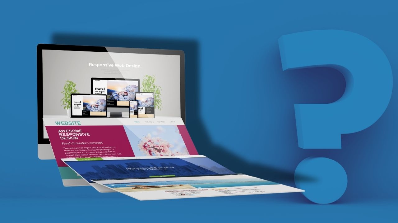
What Is Responsive Design? The Proven Method to Streamline Your Website
Simply put, responsive design is the magic behind websites that look great, no matter where you view them. Whether someone’s browsing on a phone, tablet, laptop, or widescreen monitor, a responsive website adjusts its layout to fit perfectly. It’s like a chameleon for the internet – it adapts to its environment seamlessly!
In terms of WordPress, choosing a responsive design means your website will automatically rearrange elements like text, images, and menus to suit the screen size.
For example, a three-column layout on a desktop might transform into a single column for mobile users, making it easier to read and navigate. The goal is to provide a consistent, enjoyable experience for anyone visiting your site, regardless of the device they’re using. And trust me, it’s worth it – your visitors will thank you!
Why Should Your WordPress Website Be Responsive in Today’s Mobile-First World?
Here’s the hard truth: more than half of all internet traffic now comes from mobile devices. According to recent stats, over 60% of users access websites on their phones. If your website WordPress isn’t mobile-friendly, you’re basically shutting the door on a massive audience. Yikes!
Think about it – how often do you search for something on your phone? Imagine landing on a site where the text is tiny, buttons are too small to tap, and images take forever to load. Frustrating, right? That’s exactly why responsive design is critical. A website that adapts beautifully to mobile devices keeps users happy, engaged, and far less likely to hit that back button.
Plus, there’s another big reason to care about mobile users: Google. The search engine giant prioritizes mobile-friendly websites in its rankings, thanks to its mobile-first indexing. In plain English, if your site isn’t responsive, it’s going to take a hit in search engine rankings.
So, if you want your website WordPress to show up on the first page of search results, a responsive design is non-negotiable.
How a Responsive Website WordPress Boosts Mobile User Engagement and SEO
A responsive website on WordPress plays a pivotal role in boosting mobile user engagement and SEO performance. With more than half of all web traffic coming from mobile devices, ensuring your site looks and functions seamlessly across smartphones and tablets is crucial.
A responsive design adapts your website’s layout, images, and navigation for an optimized mobile experience, leading to faster load times, easier navigation, and better overall usability. These improvements keep visitors engaged longer and reduce bounce rates, two key factors that search engines like Google use to rank websites.
Additionally, Google’s mobile-first indexing rewards sites that are mobile-friendly, giving your responsive WordPress website a better chance of ranking higher in search results. By prioritizing mobile users, a responsive WordPress site ensures that both your audience and SEO efforts are thriving.
Maximize Performance with the Best Responsive WordPress Themes
Now that you know why responsive design is essential, let’s talk about how WordPress makes it easy. One of the best things about WordPress is the huge variety of themes available – and many of them are already designed to be responsive. Here’s a quick roundup of some standout options:
- Astra: Lightweight, fast, and fully responsive, Astra is perfect for any type of website. Plus, it’s super customizable.
- OceanWP: Known for its mobile-friendly layouts, OceanWP offers fantastic performance and works seamlessly on all devices.
- GeneratePress: This theme is all about speed, simplicity, and responsiveness. It’s a great pick for beginners and pros alike.
- Divi: A premium theme with a built-in page builder, Divi is designed to make creating a responsive website a breeze.
- Neve: Modern and minimalist, Neve is optimized for mobile and works perfectly with WordPress page builders.
All of these themes are built to adapt to every screen size without breaking a sweat. Still, you’ll want to test them out before committing to make sure they fit your site’s unique needs.
How to Instantly Test Your Website’s Responsiveness for Maximum Impact
Creating a responsive website WordPress doesn’t stop at picking the right theme. You also need to test your site to ensure it performs well on different devices. The good news? There are plenty of tools and methods to help you out.
- Google’s Mobile-Friendly Test: Enter your website’s URL, and Google will tell you whether it’s mobile-friendly or not. It even points out specific issues, like text being too small or clickable elements too close together.
- Browser Developer Tools: If you use Chrome or Firefox, their developer tools let you preview your site on a variety of screen sizes. Just right-click on your site, select “Inspect,” and toggle to the device view.
- Responsive Design Checker: This handy tool allows you to test your site on a wide range of devices, from iPhones to tablets and beyond.
- Actual Devices: While tools are great, nothing beats testing your website on real devices. Borrow your friends’ phones or tablets and see how your site looks in action.
Testing responsiveness isn’t just about appearance – it’s also about functionality. Make sure buttons are easy to tap, menus are simple to navigate, and images load quickly. A little testing goes a long way in keeping your visitors happy.
Final Thoughts: Unlock the Secrets to Ultimate Website Success
Responsive design is no longer optional – it’s the heart and soul of any successful websiteWordPress. With mobile users dominating the internet and Google rewarding mobile-friendly websites, creating a responsive site is one of the smartest moves you can make.
By understanding what responsive design is, recognizing the importance of mobile users, selecting the right theme, and testing your site thoroughly, you’ll ensure your WordPress website is ready to impress on any device. So go ahead, embrace responsive design – your audience (and your SEO rankings) will thank you!
Contact us
If you’re looking to enhance your online presence or need assistance with your website, feel free to reach out to us at Jainya. Our team is dedicated to addressing your specific business needs, whether it’s website design, digital marketing, or software solutions. We understand the importance of having a website that not only looks great but also functions seamlessly across all devices.
At Jainya, we pride ourselves on offering competitive pricing and tailored services that fit within your budget. Whether you’re a startup or an established business, we’re here to help you achieve your online goals. Don’t hesitate to contact us for any inquiries or to discuss your project further. Let’s work together to create a website that truly represents your brand!
Leave a Comment