
The objective of this post is to provide readers with an overview of modern web design concepts and to welcome them to the article. In today’s digital ecosystem, it is important to provide direction on how to use successfully and to introduce the role that web design plays.

The design’s principles are the basic rules that help it look good and work well. Balance, contrast, focus, movement, pattern, rhythm, and unity are some of these rules. Designers can make designs that look better and work better by following these rules. We will talk about each of these principles and how they help a design work in this piece. These rules are important for making great drawings, whether you’re just starting out or want to get better.
The Role of Web Design in Today’s Digital Landscape
In today’s digital landscape, web design serves as the link between technology and human connection. It is through craft and science that the immensity of the internet is made accessible, interesting, and successful. The significance of web design cannot be overstated—it shapes user experience, governs engagement, and ultimately determines whether a product or service succeeds or fails.
This manual examines how web design interacts with user psychology, corporate strategies, and technology. You’ll discover how smart design may improve accessibility, why flexible frameworks are vital in a mobile-first environment, and how structural choices affect SEO.
As we enter an era in which the physical and digital divides merge, web design stands out as a critical discipline that will define the future of how we interact, transact, and perceive our world. With this article, we hope to inspire you to be at the forefront of this thrilling and ever-changing adventure.
What are the design principles?
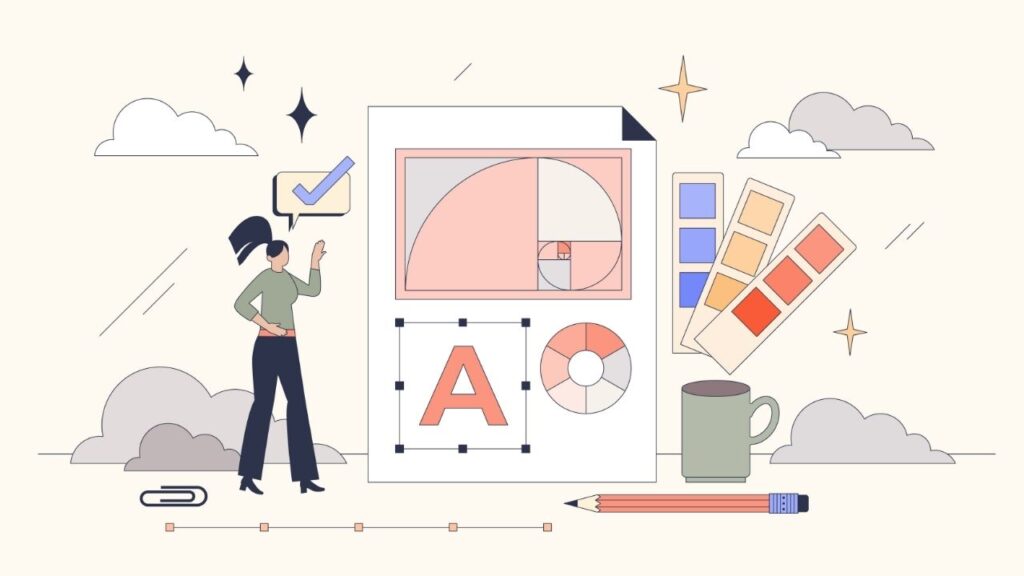
A design’s principles are the basic rules that help it look good and work well. They show how to arrange things in a plan so that it looks good and works well. These are the main rules of design:
- Balance: means putting things in an even way to make things feel stable.
- Contrast: Using differences in color, shape, or size to make things stand out is called contrast.
- Emphasis: means drawing attention to the most important parts of a design.
- Movement: means leading the eye through the design in a certain way.
- Patterns: are things that are repeated to give the impression of order and regularity.
- Rhythm: is making things feel like they are moving by repeating them at regular times.
- Unity: Being united means making sure that all the parts of the plan work together.
Being united means making sure that all the parts of the plan work together.
Principles of Design
As we already talked about, different designers follow different design principles. However, here is a list of the most important and widely used design principles.
Balance
Balance just means that everything looks good. Finding the right mix is like trying to make your website look good. One side of the website shouldn’t have all the information, while the other side should have almost nothing. There are three ways to find balance: horizontally, asymmetrically, and symmetrically.
Alignment
The way things are put on a website is called alignment. Most of the time, alignment is used to make text written on the left, center, right, or justify match. Alignment isn’t just for making sure that text lines up straight, though. It can also be used to make your design more interesting. Alignment helps artists be more creative with their work. Good alignment makes sure that your text is easy to read, which in turn makes sure that your point gets across.
Using Again
Repetition is a way to make a pattern in the thoughts of the person using the user interface. Repetition is all about making sure that the design is consistent and that all of the parts work together. The naturally intuitive design concept that is probably used the most is repetition. It’s very rare that a website doesn’t have even a small amount of repetition. Typefaces are the most obvious example of repeat. Every paragraph has the same font size, and each H1 heading should look like every other H1 heading, each H2 heading should look like every other H2 heading, and so on. This makes the text flow together. Of course, repetition is a great way to build a brand, style, uniformity, and a better user experience. Typefaces, button sets, styles, spacing, and most importantly, the top and footer of a website should all use repetition in the same way.
Contrast
Contrast is a design concept that says we should try to make some things stand out from others. We can do this by using different colors, fonts, typography, repetition, alignment, or anything else. This is meant to make a certain part or image stand out for users. When it comes to design, difference means putting together two things that are very different from each other. It’s called contrast when you see a difference between two things in the user experience that makes them stand out as being different. This difference could mean that they are in different groups, serve different purposes, act in different ways, etc.
Hierarchy

The principles of design are very important for organizing topics in a structured way when making designs that store data in a sequential order. The use of design principles makes it easier for the user to move between topics by creating a visual path that follows design principles by beginning with the most basic and moving to less important paths. To make things clear and easy to navigate, you can follow the rules of design by using different font sizes to set the order, like making the top one the H1 tag and the ones below it H2, H3, and so on.
Emphasis
When making images, it’s important to follow design principles so that your work looks better and has more meaning. The least amount of writing and the most graphics and images. You can draw attention to the posts with outlines and add pictures to them with frames. It gives the design a sleek, well-balanced look. When it comes to graphic design, borders around designs or pictures are very important because they draw people’s attention more visually than just text.
White Spaces
So that the design doesn’t look crowded and disorganized, it’s good design practice to leave some white space around the picture to keep its good looks and design. It helps the visual hierarchy and makes it easy for the user to move from one piece of information to another. Adding white space to a design helps keep it organized and makes it stand out on its own.
Proportion
The size and scale of two things in a design are set by their proportion. Having the right proportions in design helps give each part of the design its own personality. Keeping things in proportion with each other helps show how they relate to each other more clearly. The way they are connected makes the design look nice and appealing. It helps keep the parts that are alike together. It also helps keep the visual balance between the different parts of a design that have different identities.
The Color Theory and Typography
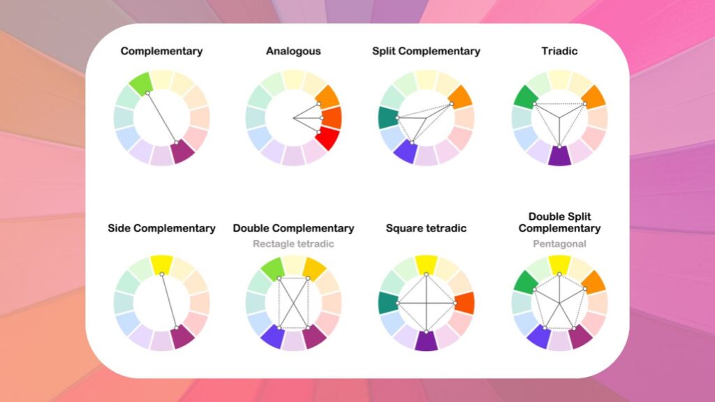
Balance: A website with good balance is stable and easy to use. Asymmetrical layouts can be lively and interesting, while symmetrical layouts give off a serious, well-organized vibe.
Contrast isn’t just about colors; it’s also about using different sizes, shapes, textures, and even fonts to draw attention and direct the user’s eye.
Harmony: All the parts of a web design work together to make a whole that flows smoothly. Style, color, and type that are all the same make the user experience smooth.
Philosophy of User-Centered Design
Customer Needs: This way of designing starts with figuring out what the customer wants and needs. Every part of the website is looked at from the point of view of the user.
Design Thinking: is a way to solve design problems by coming up with ideas, making prototypes, and trying them.
Accessibility: One of the main ideas behind user-centered design is making sure that websites can be used by people of all abilities.
Feedback Loops: The website develops to better serve users by trying and improving it all the time based on what users say.
Planning and Workflow
Web design projects that go well depend on good planning and control of the work flow. This chapter goes into detail about the important steps of figuring out what the users want and what the business’s goals are, making wireframes and prototypes, and putting in place project management and collaborative processes.
| Section | Description |
|---|---|
| Knowing User Needs and Business Goals | How User Needs and Business Goals Fit Together: Sites that are well-made connect what people want and what a business wants to achieve. Users may want to find information or have an easy time making a purchase. Business goals may include making more sales, getting more leads, or helping customers. |
| Research and Data Analysis | Collecting both numeric and qualitative data is the first step in research and data analysis. To learn more about your users, use analytics, polls, user testing, and market research. The ways that business goals will be measured will be decided upon in strategic meetings with partners. |
| User Personas and Business Vision | Make detailed user personas that show the traits, behaviors, and goals of your target group. In the same way, make a clear business goal that fits with what you’ve found. This two-pronged approach makes sure that the end design meets both user and business needs. |
| Making Wireframes and Prototypes | Wireframes: Start the planning process with wireframes, which are like building plans for the web. These sketches or low-fidelity versions are very important for figuring out how a webpage is put together without getting bogged down in design details. |
| Prototyping | Once the wireframes are accepted, you can move on to the prototyping step. As compared to the final result, a prototype is pretty close to the real thing. It gives you an interactive model to test how people use the design, which is useful information that wireframes can’t give you. |
| Tools and Techniques | For wireframing, use tools like Balsamiq. For modeling, use Adobe XD or Figma. Walk through the process of making wireframes and prototypes with a focus on iterative design, which means making changes all the time based on tests and feedback. |
| Software and Tools for Design | As the field of web design changes all the time, it’s important to keep up with the newest and best design tools in order to do good work. Here are some of the best design tools that have become standard in the field. |
Adobe XD
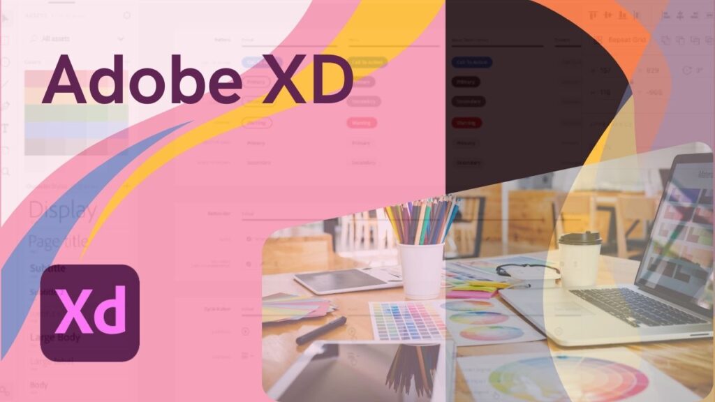
In short, Adobe XD is a strong vector-based tool for designing the user experience of web and mobile apps. As part of the Adobe Creative Cloud suite, it makes the planning process smooth and makes it easy for everyone involved to work together.
Features:
- Repeat Grid: This feature lets creators make copies of things like galleries or lists. The spacing and style stay the same, which makes designs with a lot of information easier to read.
- Prototype and Animation: Designers don’t need any extra tools to make interactive prototypes. With this feature, you can create and test transitions and small interactions all in one place.
- Voice Prototyping: XD lets designers make voice-activated interfaces by supporting voice requests and speech playback.
- Collaboration: The ability to co-edit and share in real time makes it easier for teams to work together and for clients to give feedback.
Figma
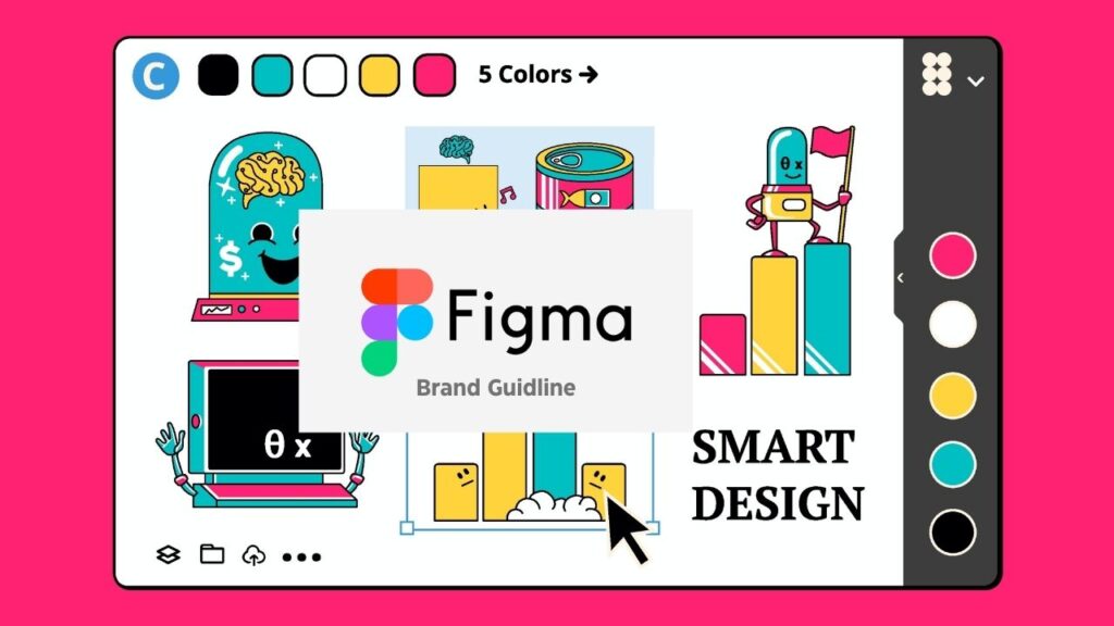
Summary: Figma has quickly become a favorite among artists because it is web-based and lets people work together. The interface is easy to use, so both expert and new designers can use it.
Key Points:
- Cloud-based: You can access it through a browser, so you don’t have to run any software. It also updates itself automatically.
- Component libraries: let designers make reusable design parts called components that can be used across a whole project and updated to keep things consistent.
- Collaboration Design: Many people can work on the same file at the same time, making it like Google Docs for designers.
- Integrations and plugins: Figma’s features can be expanded with a lot of plugins that do things like add stock images and make sure that the design system is consistent.
Summary of Sketch
Sketch is a popular tool for UI/UX design because it is easy to use and has strong vector editing features. It is only available for mac OS. It’s known for having a large community of plugins.
Features:
- Symbols: Sketch’s symbols make it easy to reuse and nest design features, which speeds up the design process.
- Prototyping: Designers can use Sketch to make simple clickable prototypes.
- Teamwork: Sketch for Teams moves teamwork to the cloud, which makes it easier to share and get feedback.
- Plugin Ecosystem: There are a huge number of third-party plugins that can add to Sketch’s built-in features and make them more useful. For example, some plugins can automate chores or make workflows better.
Working together on projects and collaborative workflows
Effective Teamwork: Working together is very important in an area like web design that has a lot of different parts. Use tools that let you share files and talk to each other in real time. Communication tools like Slack and project management tools like Asana make sure that everyone is on the same page.
Approaches to Project Management: Web design projects can use Agile, Scrum, or Kanban approaches to project management. These models support adaptable planning, steady growth, and constant improvement. They also support quick and adaptable responses to change.
Iteration and Feedback Loops: Set up regular check-ins and feedback loops with clients and other important people. To improve and tweak the product, constant feedback is built into the planning process.
Documentation: Keep detailed records of all the steps you take during the planning process. This is a guide and makes sure that everyone is responsible, which is very important for the project’s success and helps keep things going even if team members change.
Designing for Usability
Making a website that is usable makes sure that people can find their way around it and connect with it easily. This chapter will go into more detail about the rules and habits that make good usefulness in web design possible.
| Section | Description |
|---|---|
| Making Navigation Easy to Use | Designers need to make sure that navigation is easy to use and reliable. This includes using logical structure, providing navigation aids like search bars and breadcrumbs, and using clear labels that avoid jargon. |
| Logical Structure | Organizing content into groups that make sense to the user enhances usability. |
| Navigation Aids | Providing search bars, breadcrumbs, and clear groupings helps users find what they’re looking for. |
| Clear Labels | Using language that is easy for the audience to understand and avoiding jargon and academic terms. |
| Making Designs Accessible | Web accessibility ensures that all users, including those with disabilities, can view and use web content. |
| Semantic HTML | Using HTML elements as intended to convey structure and meaning. |
| ARIA Roles | Using ARIA roles when HTML elements are insufficient for accessibility. |
| Keyboard Navigation | Ensuring that users can navigate the page using a keyboard. |
| Color Contrast | Ensuring sufficient contrast between text and background colors for users with visual impairments. |
| Alternative Text | Providing alt text for images allows screen readers to describe images for visually impaired users. |
| Content Strategy and Readability | A good content strategy relies on labeling, organizing, and structuring content for ease of use. |
| Clear Language | Using short, simple language to communicate directly with users. |
| Typography | Using readable font sizes, line lengths, and spacing to enhance readability. |
| Content Structure | Using headings, bullet points, and numbered lists to make text easy to scan. |
| Visual Hierarchy | Using design elements to indicate the importance of information, guiding users to find what they need. |
| Conclusion | Usability is not just a design feature; it is a fundamental aspect of successful web design. Following these principles can lead to websites that are both functional and enjoyable to use. |
Design that is responsive and adaptable
It’s important to use responsive and adaptable web design when making websites that look great on a lot of different devices. It is the topic of this chapter to talk about the methods and tactics that make websites adaptable and easy to use on all devices.
| Main | Description 1 | Description 2 | Description 3 |
|---|---|---|---|
| Layouts and Grids that Move | Fluid Grids: Flexible design uses fluid grids with relative units like percentages instead of fixed pixels, allowing layouts to adapt to screen sizes. | Learn about relative sizes using percentages, ems, and rems with fixed-width layouts. | Using Images and Media That Can Be Scaled: Ensure images scale with the grid while maintaining their aspect ratio. |
| Media Queries and Static Points | Media queries enable content to adapt based on screen resolution, orientation, and color scheme. | Implementing Breakpoints: Identify optimal breakpoints in your design for various devices. | Responsive typography adjusts settings for better readability across devices. |
| Strategies for Mobile-First vs. Desktop-First | The mobile-first approach designs for smaller screens first, while desktop-first does the opposite. | Pros of Mobile-First: Starting small can enhance speed and user experience on mobile devices. | Thoughts on Desktop-First: Consider when it might be better to start with a desktop-first method based on audience needs. |
| Testing and Improving Responsive Designs | Testing is crucial to ensure designs work well across devices. | Pros and Cons of Emulators: Evaluate the effectiveness of using emulators versus real hardware for testing. | Trouble Spots in Responsive Design: Identify common issues and strategies to avoid them. |
| Feedback Loops and Iteration | Establish processes for continuous improvement based on testing feedback. | Responsive and Adaptive Design: Embrace an attitude of adaptability as web technologies evolve. | This chapter lays the groundwork for understanding and applying these principles to enhance user experience. |
Visual Elements of Web Design
Visual elements are what web design is all about; they show how something works, make people feel, and share ideas. To make interesting and useful websites, you need to learn how to use them well.
| Main Topic | Description |
|---|---|
| Making Good Use of Images and Icons | When it comes to web design, images and icons speak a language that people of all languages and cultures can understand. Their planned use can improve readability, aesthetic appeal, and ease of use. |
| White Space: The Role | White space, also called negative space, isn’t just empty space; it’s an active feature that organizes content, controls flow, and makes writing easier to read. |
| Animations and Small Bits of Interaction | Micro-interactions and animations are not just for looks. They are useful parts that enhance the user experience when used correctly. |
| Movies on the Web | Video is now an important part of online stories because it can convey complex ideas quickly and engagingly. |
| Imagery in Design | Each picture should have a clear job to do, like showing an idea, making someone feel something, or directing someone’s attention. |
| Image Quality | You must be able to see high-resolution pictures quickly. For the best results, think about how to balance image quality and file size. |
| Benefits of White Space Focus | White space can draw attention to or away from something, telling users where to focus their eyes. |
| Why Animations are Used? | Animations can guide users through tasks by showing them how to do them and making the interface easier to understand. |
| Video Engagement | Videos can quickly grab users’ attention and keep it longer than text or still pictures. |
| Relevance | Pictures on your website must be related to the text and help tell the story it’s trying to convey. |
| Organization | Putting things together or apart helps create a visual order that makes the interface easy to use. |
| Feedback | They provide instant feedback, like letting you know that an action was completed, which helps users make fewer mistakes. |
| Information Density | A short movie can show a lot of information in a way that is easy to understand. |
| Accessibility | Make sure that pictures have alt text so that people who use screen readers can understand them. |
| Readability | Ensuring there is enough space between lines of text and around content blocks can significantly enhance readability. |
| Small-scale Interactions | Small touches, like a button changing color when you hover over it, can engage users and make the interface feel more alive. |
| Use of Icons in Design | Icons should be easy to recognize, and when possible, they should use familiar symbols to represent functions and ideas. |
| Putting White Space Macro and Micro into Action | Learn the difference between macro and micro spaces. Macro spaces are larger areas in design layouts, while micro spaces are the spaces between smaller elements like list items. |
| The Key is Subtlety | Using too many graphics can be overwhelming. The best movements are subtle and timed just right. |
| Consistency | To make the design flow smoothly, keep the icon forms (line weight, size, and level of detail) consistent throughout. |
| Balance and Harmony | Space out design features with white space to create a stable and harmonious layout. |
| Context | Be smart about how you use video and ensure it fits in with your content plan. |
Advanced CSS Techniques
CSS tells the browser how to show HTML parts on a web page. It gives HTML parts colors, positions, and other settings. You can also use it to make animations and make your web page bigger. Web developers and designers are always looking for new and cool CSS tricks and tips to try out and help make CSS better.
As CSS grows in popularity, developers and artists have a lot of options for making websites that are both interesting and work on all browsers.
Learn some advanced CSS tricks and tips in this lesson that will help you get better at web design and development in the year 2024.
Introducing CSS Preprocessors
- CSS Preprocessors: Tools like Sass (Syntactically Awesome Stylesheets) and LESS extend CSS capabilities with features such as variables, nesting, and mixins, making CSS more maintainable and modular.
Sass
- Variables: Store reusable values like colors and fonts.
- Nesting: Write nested selectors for improved readability, mirroring HTML structure.
- Partials and Import: Split CSS into smaller files (partials) and import them into a main file.
- Mixins: Reuse styles and manipulate them with arguments.
- Functions: Perform complex operations within stylesheets.
LESS
- Variables: Similar to Sass, allows for reusable values.
- Mixins: Reuse styles without passing arguments.
- Nested Rules: Organize code with nested selectors.
- Functions & Operations: Enable complex calculations and logic in CSS.
Enhancing the Styling Process
- Both Sass and LESS streamline CSS coding by introducing programming logic, saving time, and reducing code repetition. They compile to standard CSS, ensuring browser compatibility.
Flexbox and CSS Grid Systems
- Flexbox:
- Alignment: Easily align items vertically or horizontally.
- Flexibility: Elements can grow or shrink to fit available space.
- Order: Visual order can differ from markup order.
- CSS Grid:
- Grid Definition: Define columns and rows with simple syntax.
- Placement: Place items anywhere on the grid, not just sequentially.
- Overlap: Items can overlap, allowing for diverse layouts.
Comparing and Combining
- Flexbox is ideal for one-dimensional layouts, while CSS Grid excels in two-dimensional layouts. They can be combined effectively, using Flexbox for components and Grid for overall layout.
CSS Animation and Transitions
- CSS Animations:
- Keyframes: Define stages and styles of animations.
- Animation Properties: Control timing and duration.
- CSS Transitions:
- Transition Property: Specify which properties will animate.
- Duration: Set the length of the transition.
- Timing Function: Determine the speed curve of the transition.
Creating Theming with CSS Variables
- CSS Variables (Custom Properties):
- Maintainability: Change a value once to update it everywhere.
- Scope: Variables can be global or local.
- Fallbacks: Provide fallback values for invalid custom properties.
- Leveraging CSS Variables for Theming:
- CSS variables facilitate efficient theming, allowing for quick changes to color schemes or font stacks, ideal for dark mode and multi-brand designs.
Mastering these advanced CSS techniques opens up new possibilities for web design and development, enabling the creation of sophisticated, responsive, and maintainable web interfaces.
Leave a Comment